Branding – particularly unified, system-wide branding – has long been an interest of mine alongside my day job. I am not a branding professional by any means, but I enjoy thinking about how design and identity interact, especially in public services where clarity really matters.
That is partly why I did not rush to comment on the new Great British Railways (GBR) logo and livery when they were announced this week. I wanted to sit with it for a while, think about other networks, and decide whether my initial reaction held up. The other reason is simpler: I do not actually hate it. In fact, with a few relatively small changes, I think it could be very good.
What follows is my thinking.
For transparency, I am employed by a privately owned train operating company that is due to come into public ownership in 2026. None of the views below represent those of my employer.
The logo: confidence in restraint
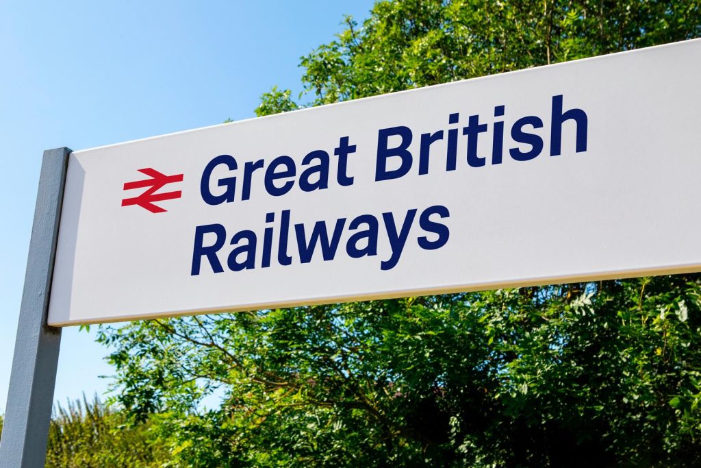
At a basic level, the logo works and the colour palette feels right. My reservations are not about how it looks, but about what it spells out – the name itself is a separate debate and one best had another time.
What genuinely matters is the decision to retain the double-arrow, and to retain it properly. That symbol is one of the most recognisable pieces of transport branding not just in Britain, but around the world. Dropping it would have been a huge mistake.
My concern is not that the symbol exists, but that it is being over-explained. The double-arrow does not need ‘GBR’ written next to it everywhere to legitimise it. It already carries meaning and recognition on its own. Used confidently, it can do far more work than a wordmark ever could.
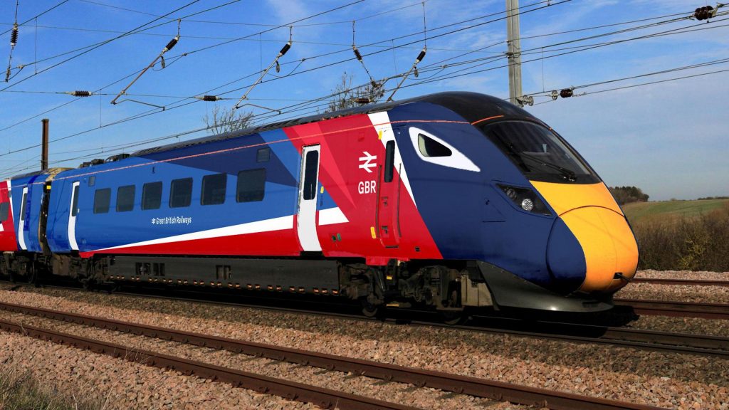
The livery: strong, but trying too hard
The new livery is a solid piece of work. It is unmistakably British, visually confident, and far more consistent than the sea of vinyls we have become used to over the past thirty decades.
That said, it feels like it is trying to do slightly too much. Applying the more complex elements of the design across every vehicle, in every direction, weakens the impact. I think the livery would be significantly stronger if the driving vehicles carried the full treatment, while intermediate vehicles were finished in a simpler, complementary solid colour.
One change I feel particularly strongly about is the removal of the GBR wordmark from the sides of trains. It adds clutter rather than clarity. The symbol is already there; repeating the name alongside it does not add value.
Sub-brands: clarity over comfort
This is where I think GBR faces its biggest test of confidence.
There has been a lot of discussion about retaining familiar legacy brands such as ‘Great Western’ and ‘South Western’. I strongly feel this would be a mistake. Trying to preserve multiple historic identities within a new national system undermines the very thing GBR is meant to achieve, that being coherence.
Those names may still have a role internally, or as informal regional descriptors, but they should not survive as public-facing brands, helping to avoid a future where the railway continues to explain itself through a patchwork of inherited identities.
Digital branding: where it really matters
If there is one area where I am least convinced by what has been shown so far, it is digital.
We do not need to reinvent the wheel. There are already good examples within the industry of apps that are clear, usable and well designed. Take something like the LNER app (which is very good), align it properly with industry-wide systems and policy, and apply the GBR identity lightly and consistently.
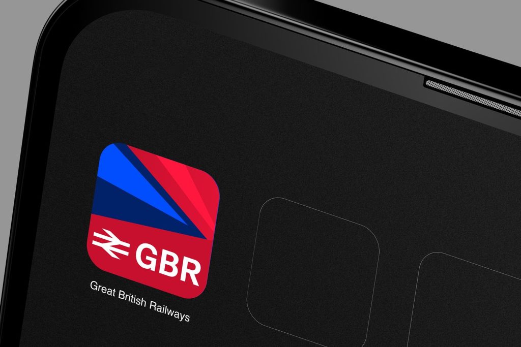
The same principle applies to the app icon. The answer is not more text. A blue-and-red background, the double-arrow on top, and nothing else would be more than sufficient.
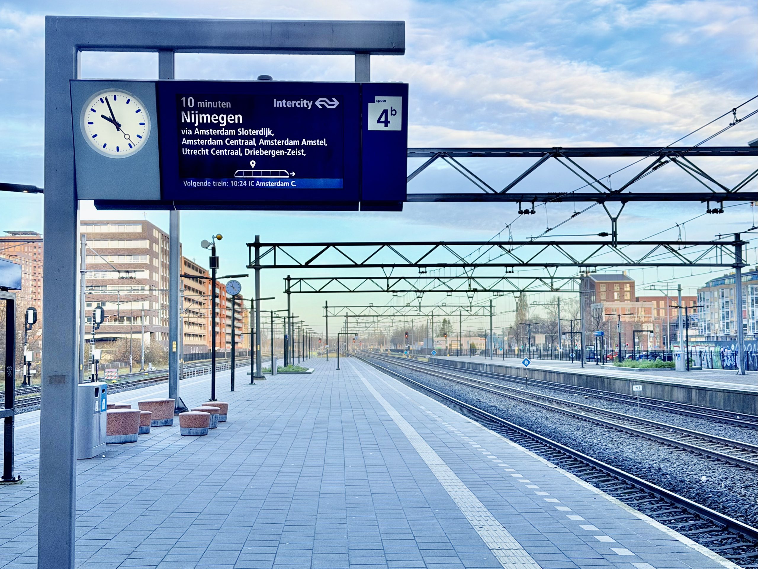
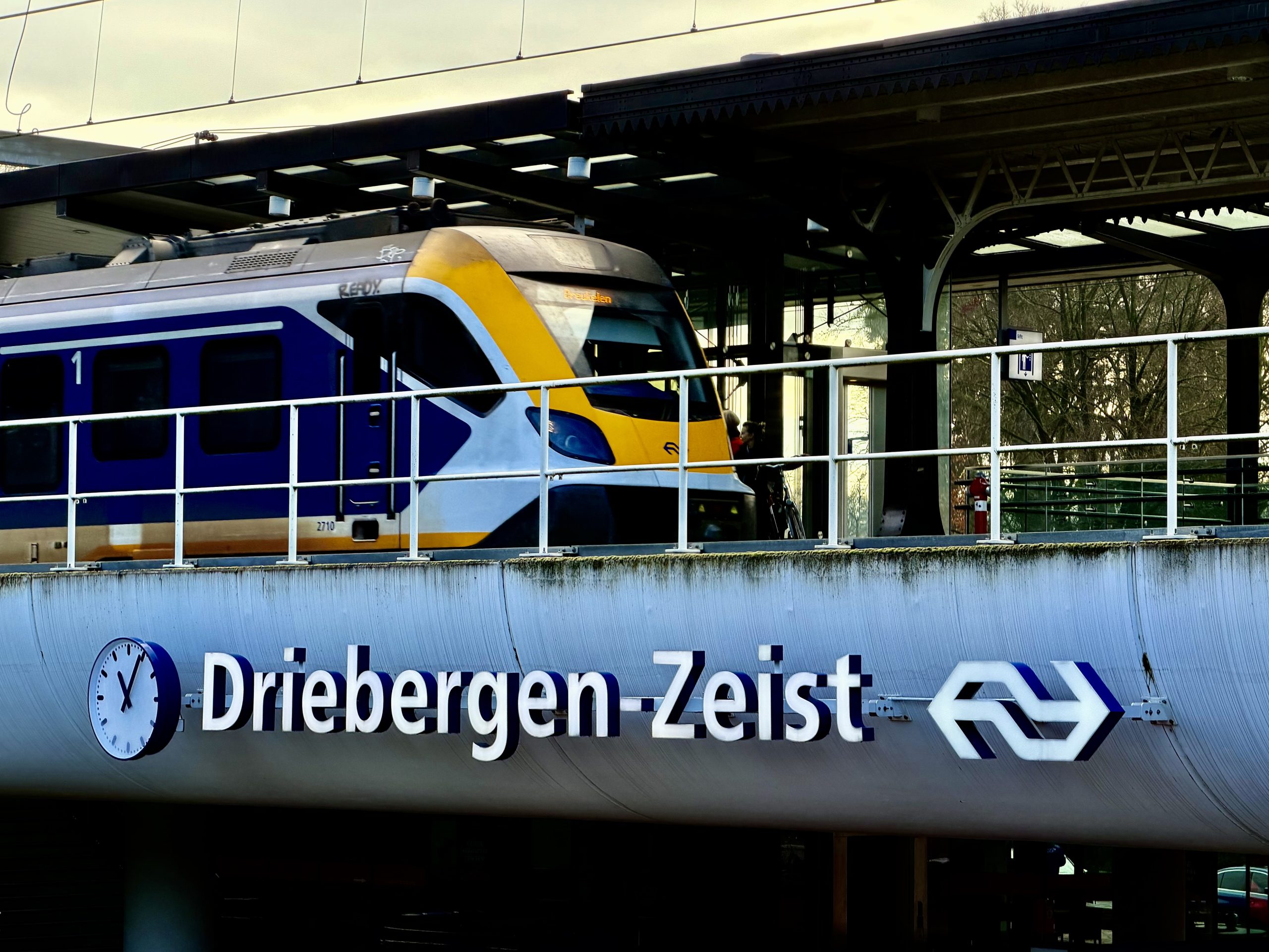
A brief diversion: lessons from the Netherlands
Earlier this week I travelled to the Netherlands and spent several days travelling around the network.
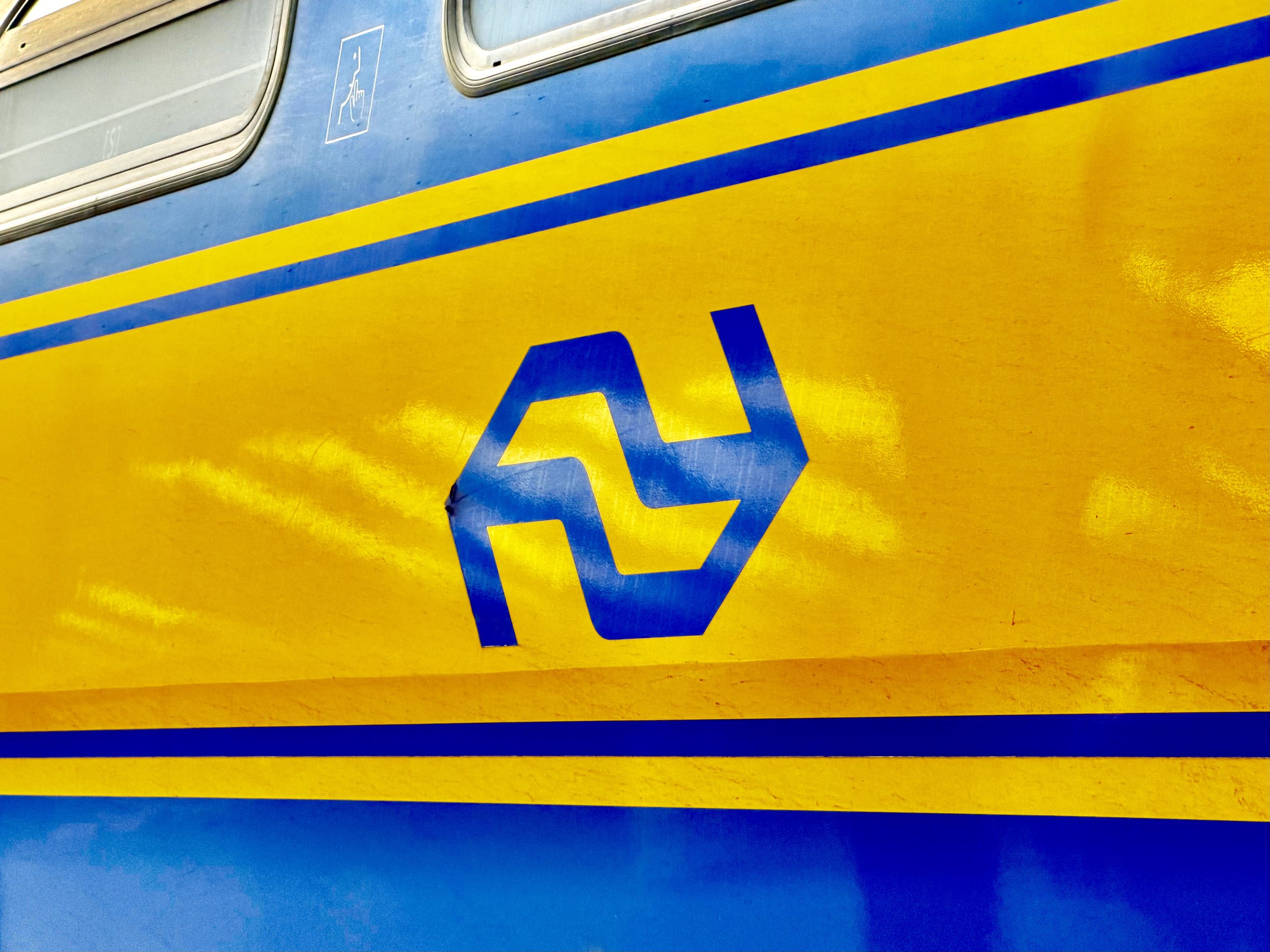
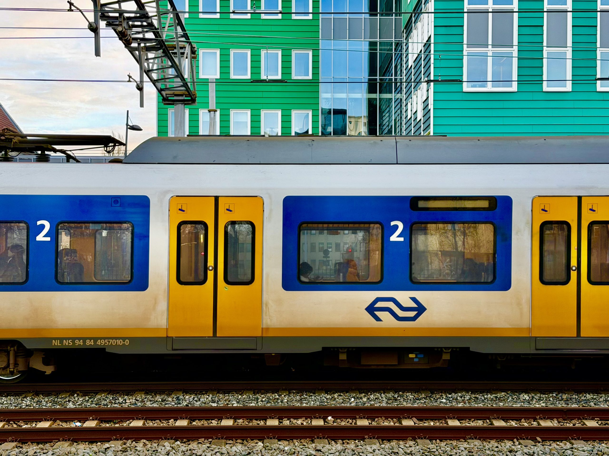
What struck me immediately was how confidently the Dutch use their core symbol. It is everywhere, yet ‘NS’ is rarely written alongside it unless absolutely necessary for corporate distinction. The symbol simply is the railway.
Just as importantly, services are clearly categorised:
- Intercity Direct for high-speed services on HSL-Zuid
- Intercity for limited-stop city-to-city services
- Sprinter for all-stop regional and suburban services, including those operated by devolved private operators like Arriva
Branding is applied consistently across trains, stations, customer information screens, Wi‑Fi portals, seating, signage and printed material. It is not flashy, but it is disciplined – and that discipline is what makes it effective.
What I would change
My suggested changes are relatively modest:
- Stop placing the GBR wordmark next to the double-arrow wherever they appear together. The symbol is the brand.
- Introduce two core liveries: a bold blue-and-red scheme for high-speed and intercity services, and a calmer, simpler livery for regional and stopping services.
From that, clear service categories naturally follow:
- Highspeed (including HS2)
- Intercity
- Regional
No revival of Network SouthEast, Regional Railways, the Intercity Swallow livery or other nostalgic throwbacks. One railway, one identity – a new start.
In conclusion
The GBR brand is a strong foundation. It is confident, recognisably British, and built around a symbol that already carries enormous public recognition. That alone puts it in a far better place than many expected.
The risk lies not in the design itself, but in how it is used. Too much explanation, too many retained legacy names, or too much visual noise would undermine what needs to be a powerful identity. The most successful transport brands succeed precisely because they know when to step back.
If Great British Railways is genuinely to function as a single system, then the brand must reflect that ambition. That means trusting the symbol, using clear service categories to support customers, and applying the identity consistently across trains, stations and – crucially – digital platforms.
The ingredients are there. What matters now is restraint and execution. Get those right, and the GBR brand could help signal a real cultural shift towards a railway that looks, feels and works as one. Get them wrong, and it risks becoming just another layer of complexity in an already crowded system.
And I found an excuse for a trip on the Eurostar. Bonus!